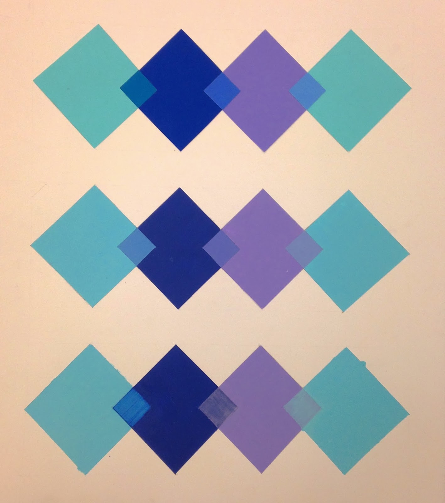
This was my transparency project, I used applied transparency for the painting. I think it was the most successful method for the shapes I had! I found the actual transparency hard to get even coats on.
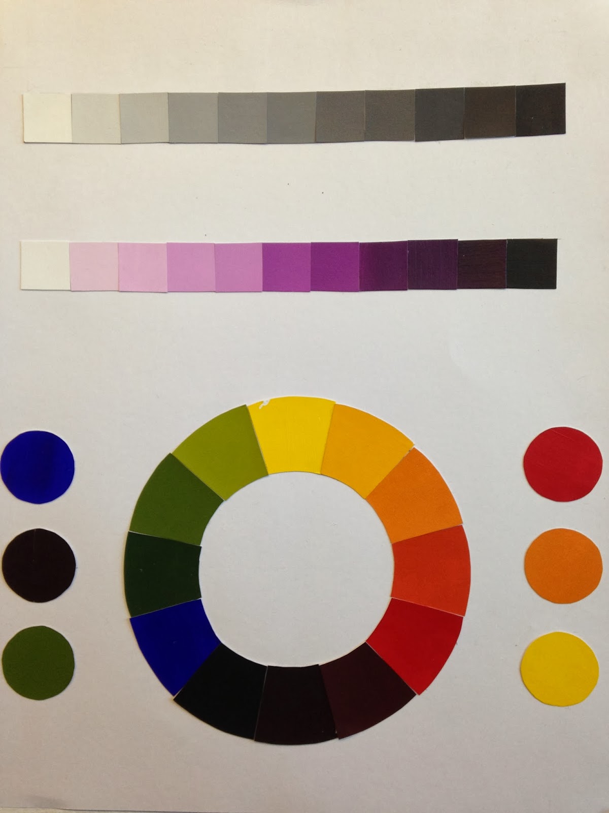
The two different works deal with making one color look like two (the purple and yellow orange) and the two colors to look as one (the blue and red). I think that the colors were more successful for the one as two, because when printed it shifted the greens to make them darker. I think composition the two as one works better to make you feel like it is one color!
Here is my Vibrating edges digitally and how it turned out when printed! The colors shifted after printing, i think it was still successful when printed but it is very successful on the computer.